
Benchling
Product Design — 2017-2020
Benchling accelerates the pace of life science research. Over 200,000 scientists around the world use Benchling as a part of their research. Benchling offers functionality for experimental note-taking, experimental design, DNA sequence design, and project management.
Analytics platform
The problem
While Benchling helps researchers store crucial information about experiments and biological entities in a structured database, accessing and visualizing data across multiple experiments was only possible using external software through an API endpoint or warehouse access. Getting day to day insights in this manner was tedious and required the clients to create internal requests for their data team, slowing down the iteration process on experiments and overall operations.
It wasn’t in Benchling’s business goals to compete with existing analytics tools that provide an extensive range of features, so the scope of the project was to offer day to day insights and key metrics inside the platform itself, which wouldn’t require users to leave Benchling or ask for support from their data teams.
While having to build an entirely new product with a small team (two developers, one product manager and one designer) was daunting, it was also easily my most exciting project at Benchling. It gave us the opportunity to start from scratch and see how good of a user experience we can create with only a small portion of the usual constraints (e.g. versioning, existing toolbars and panels, rigid UI patterns).

The solution
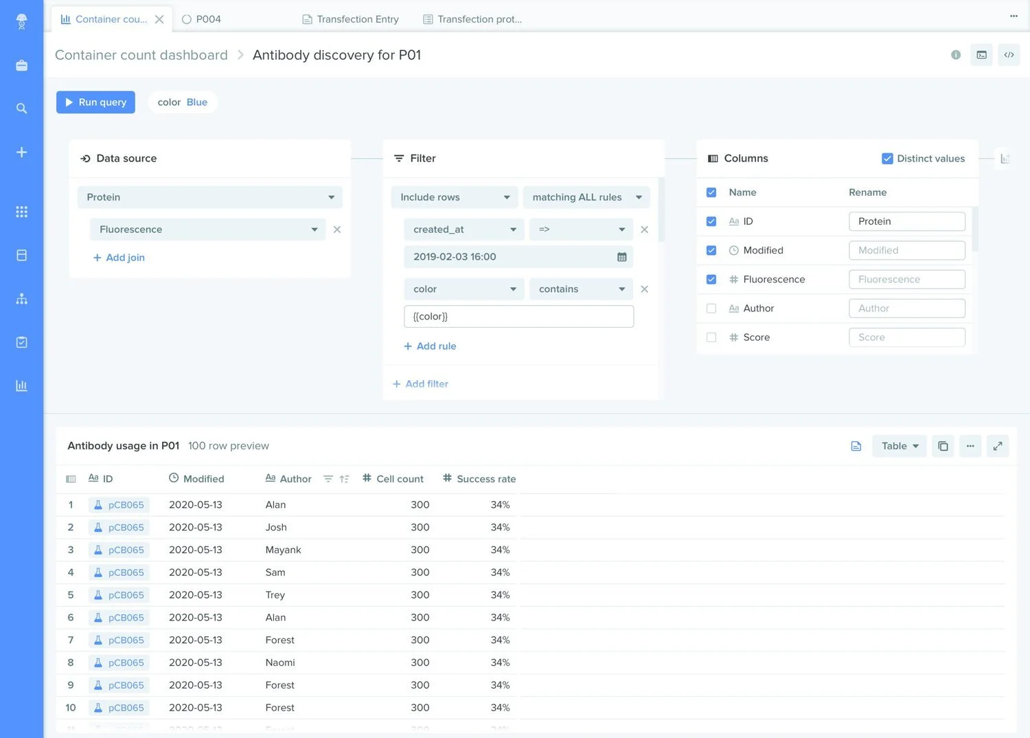
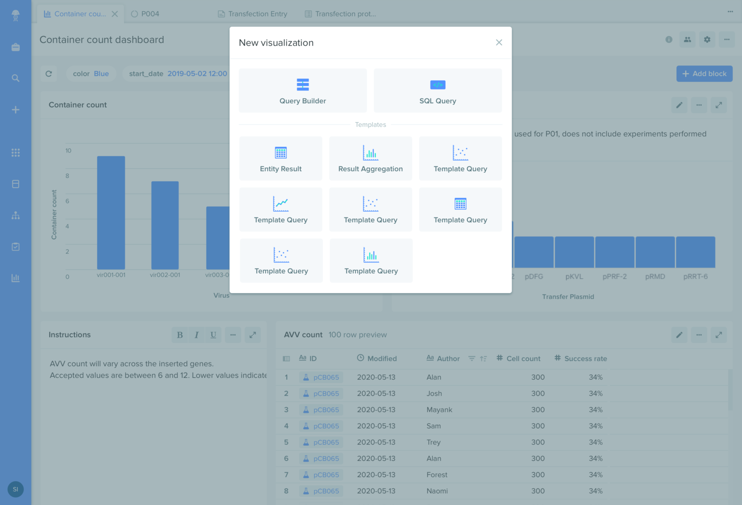
Our user research has shown that every client has highly different needs and processes in their lab, and that a generic dashboard wouldn’t be able address each use case properly. Considering this, we set out to explore a query builder functionality that would be simple enough to be used by non-technical personas, while also allowing the data teams to provide more complex SQL queries that can be re-used and adjusted over time by the non-technical teams.
Given that each dashboard can contain multiple visualizations from multiple queries, after many iterations of the design we decided to hide queries under a query edit mode, accessible through each tile of the dashboard.
At each iteration of the visual prototype, we wanted to get as much feedback as possible from our clients, resulting in a steady stream of 2-3 user research calls per week for the duration of the project. This allowed us to validate and discard hypotheses at a rapid pace, and de-risk the functional prototype that we were building in parallel with the visual prototype. While we had good competitor analysis insights to base our initial decisions on, the ongoing user research helped us pivot very quickly in terms of the layout and information architecture.
The most challenging decisions we had to make were about where these dashboards should “live” and what the permissions model should be, given that users from multiple teams (with varying permissions) would want to have access to these dashboards and their underlying data.
This decision affected the design of the new analytics module the most, given that it needed to be integrated seamlessly within the rest of the product. My responsibility as a designer during these boarder technical conversations was to predict and communicate the impacts of the data model on the UX, and to often vouch for alternatives that might require a compromise on technical simplicity in order to provide a better experience for the user.
Navigation redesign
The problem
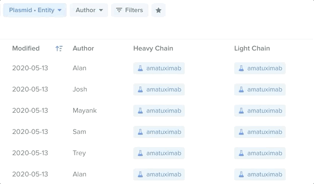
The Benchling platform has 4 different modules, each one with an item browser and a search function with unique filters, in addition to a global search mode that finds items across all modules.
By talking to users and the customer success team, we identified and ranked over 30 pain points in the browsing and searching user journeys. The major ones were:
The search mode’s UI is inconsistent with the browsing mode, making it hard for the users to orient themselves
Tabs within two of the modules create a confusing hierarchy, especially when searching
Users don’t know when they should use the global search vs. going to a module and searching from there
The breadcrumbs and filters appear as together in the expanded view, making it hard to understand which folder the user is currently in
Filters have many different UI treatments
The solution
We started thinking about a product architecture that might fit better with the user’s mental model. The main challenge was to decide between two models :
Each module is the actual location of the items, and each can have a unique treatment / dashboard
Each module is simply a different view on the items that live in the projects and act as a special filter — the UI stays consistent between modules
After talking to users and getting a better understanding of how they organize their projects, we saw that #2 made much more intuitive sense to them because they want to see all the items related to a project in the same location (DNA sequences, entries, workflows, requests). This also meant that we needed to show all these item types in the project view and the global search. The projects tab was to become the source of truth.
The first step was to reorder the navigation elements to reflect this mental model. Projects, Global search and the Global create are now bundled on top, while the modules that offer different views on the project items are grouped in the middle.

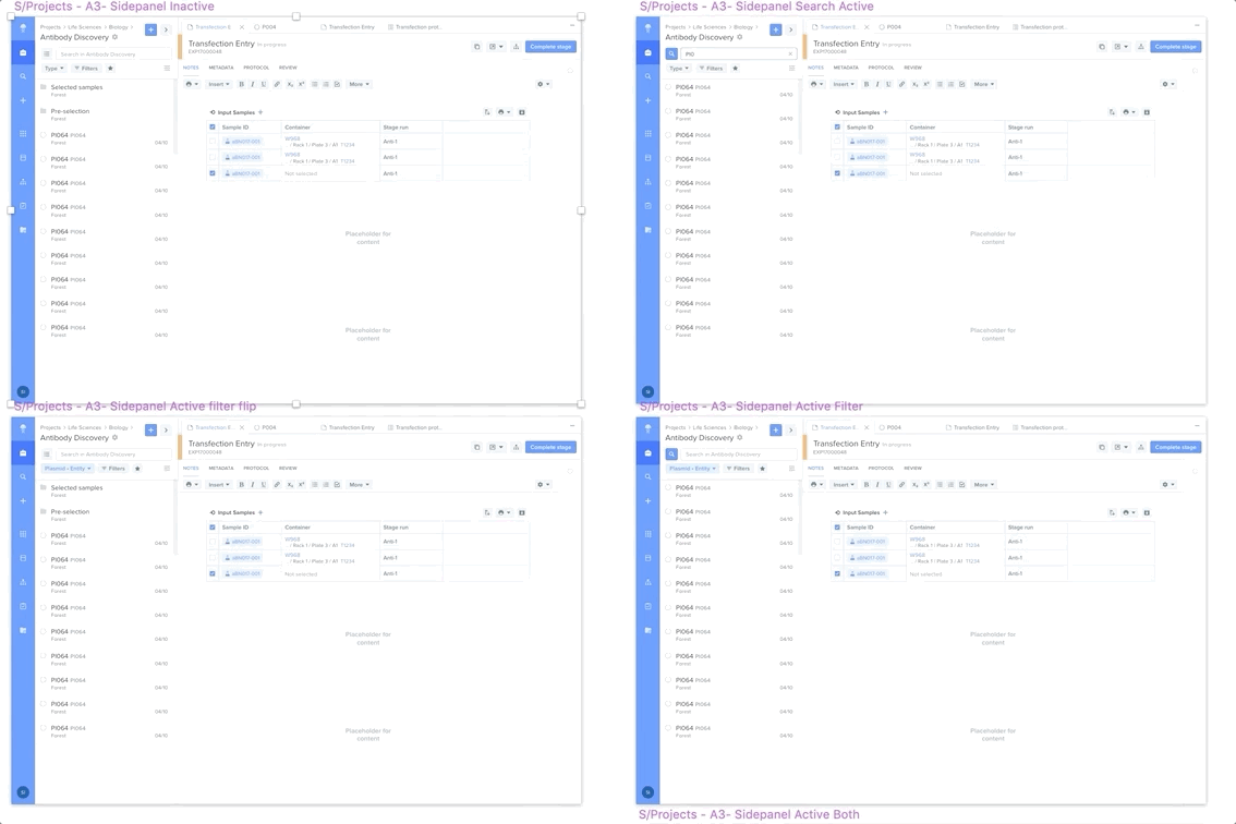
To solve the biggest pain point of the search & filtering UX/UI being inconsistent and hard to work with, I came up an approach where the search & filters could always stay present, but take as little space as possible when not used. We knew from the user research that most of the time items are found by searching and filtering instead of browsing, so keeping these one click away would not clutter the UI needlessly.
Primary & secondary filters
For each module we gathered data about the most used filters, and I suggested a UI where each filter can be set as primary or secondary. Primary filters are always shown and easy to access, while the secondary filters are bundled under the “Filters” dropdown, where a large number of filters can be combined. By creating a dropdown UI for primary filters that’s nearly identical to the secondary filters (including operators), engineers can easily move a filter from one type to the other without the need for a designer.
Breadcrumbs & tabs
What seemed to require a simple UI tweak and better visual hierarchy was actually being held by a much bigger problem the PMs have been considering for months. Fixing the breadcrumbs meant figuring out what to do with the tabbed navigation in the Projects and Registry views. Projects were split between Inventory and Notebook tabs, while Registry had Entities and Storage. Tearing these apart meant we needed to understand how researchers think about Inventory vs. Notebook, and Registry vs. Storage. After two weeks of back and forth with a few of our clients (selected to cover most types of scientific workflows and organization cultures), we validated that it made sense to merge inventory & notebooks together, while moving Storage to it’s own module and building a dashboard for it.
Once this was done, I redesigned the breadcrumbs to emphasize the current location and make them consistent across modules. For modules where there are only two levels, it provided a clear affordance to go back to the root level (e.g. see all registries) which was only possible by clicking on the module title previously and confused many users.


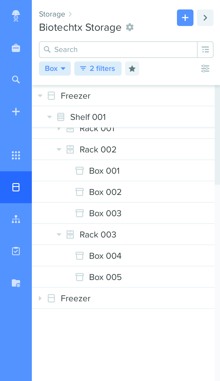
Tree view
One challenge the PMs considered nearly unsolvable was building a tree view for the projects and storage modules. Clients constantly asked for it, since a flat view provided a poor overview of the project and didn’t allow them to select multiple items across many folders, but coming up with a UX/UI for a tree view had so many challenges that the idea was never even considered. Seeing how high the need for it was, I pushed on spending at least half a day to play with it. After analyzing the major constraints, I saw that they were fairly independent, and after sketching 5-6 solutions for each, I could already see the light:
The sidepanel view has very little horizontal space. After asking more users, I found that there are rarely more than 4 levels in the hierarchy. The exceptions could be solved by:
Proper horizontal spacing
Smart ellipsizing (center)
Automatic scrolling or manual scrolling
No indicator of where the user is
I came up with a UX for freezing parent headers (see on the right) for them to act as breadcrumbs.
Pagination is hard to implement
After talking with engineers, we agreed that taking an “infinite scroll” approach could work as long as the following constraint was addressed.
Can’t select items across pages (to perform actions on)
Selection with pagination or infinite scroll is hard, but implementing a “bucket" of selected items that is stored outside the table is technically feasible.
After addressing these major constraints and providing mocks to engineers, we finally could get an estimate for it and add this “unsolvable” problem to our roadmap.
Feedback & iteration
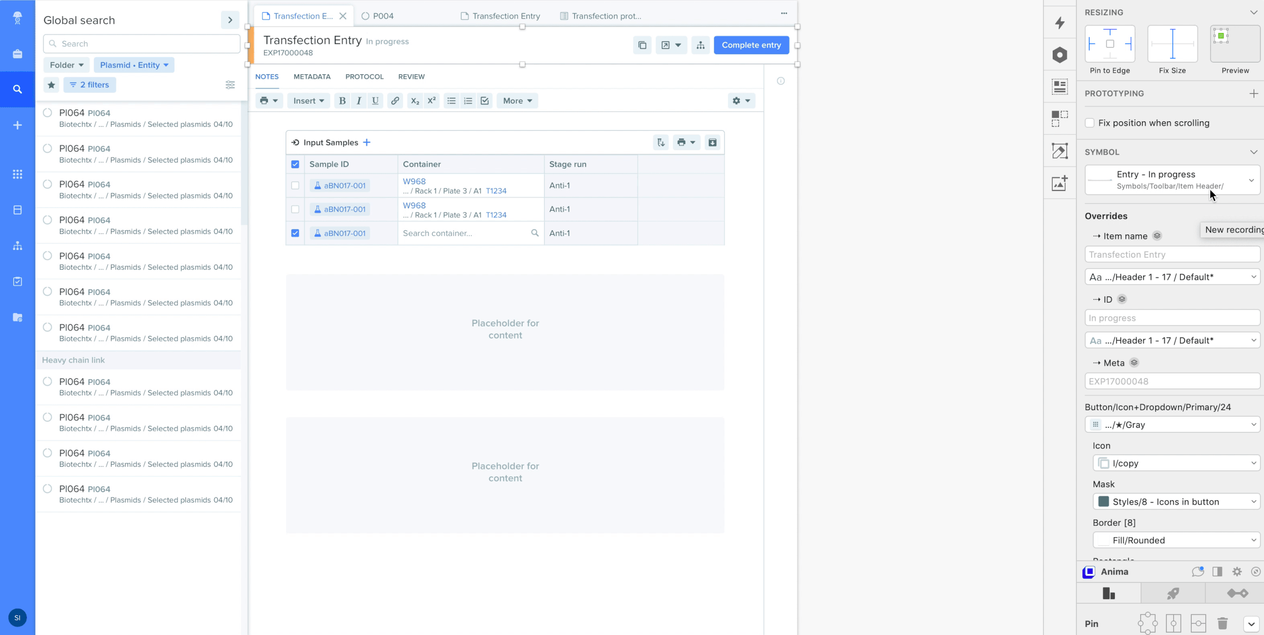
Such a large redesign should not be undertaken without first validating that the solution addresses the user stories properly and doesn’t create unintended painpoints. By creating highly interactive mocks in InVision (without even leaving Sketch thanks to the Craft Prorotype plugin), I allowed our whole team and existing clients to get an intuition for what the product will feel like and to uncover new constraints we initially didn’t consider.
Handoff & implementation
Using InVision, engineers could easily inspect each component in the mocks to implement them pixel-perfectly (hmm). To streamline the process even more, I published all new icons and components I designed to the InVision Design System Manager (DSM), so that all guidelines and SVG assets can be found in one place.
As always, PMs came back with more precise estimates from engineering and had to cut scope on the first versions, so my responsibility is also to properly plan the intermediary steps and provide V0 and V1 mocks that ensure a good user experience until come to implement the final version.

The design system
Like with most products that scale very quickly, the design challenge at Benchling was on two levels:
A need for high-fidelity mocks to be produced almost on the spot to allow for faster and better feedback from clients
A large amount of components that constantly evolve and need to be maintained
It was time for me to set up a design system that could scale with the product, for which I used Sketch Libraries and InVision DSM.
3000+ symbols with up to 7 levels of nesting
Components are responsive (stacked and resizable) wherever they’re used
1 master library (symbols, styles & guidelines) shared across per-project Sketch files
InVision DSM for maintaining product guidelines
User flows created in minutes
No more time wasted on moving elements pixel by pixel or resizing them, everything just snaps.

A consistent & constantly evolving system
When tweaks need to be made, a preview how the changes will affect the whole product can immediately be seen, across all modules and design initiatives. For projects that span over many months (e.g. the navigation redesign), seeing how the different pieces will fit together is crucial.
Guidelines directly in InVision
Easy to inspect and implement pixel-perfect components
